The comfort we
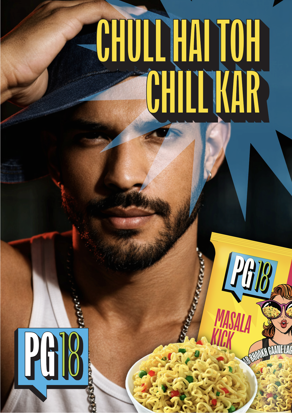
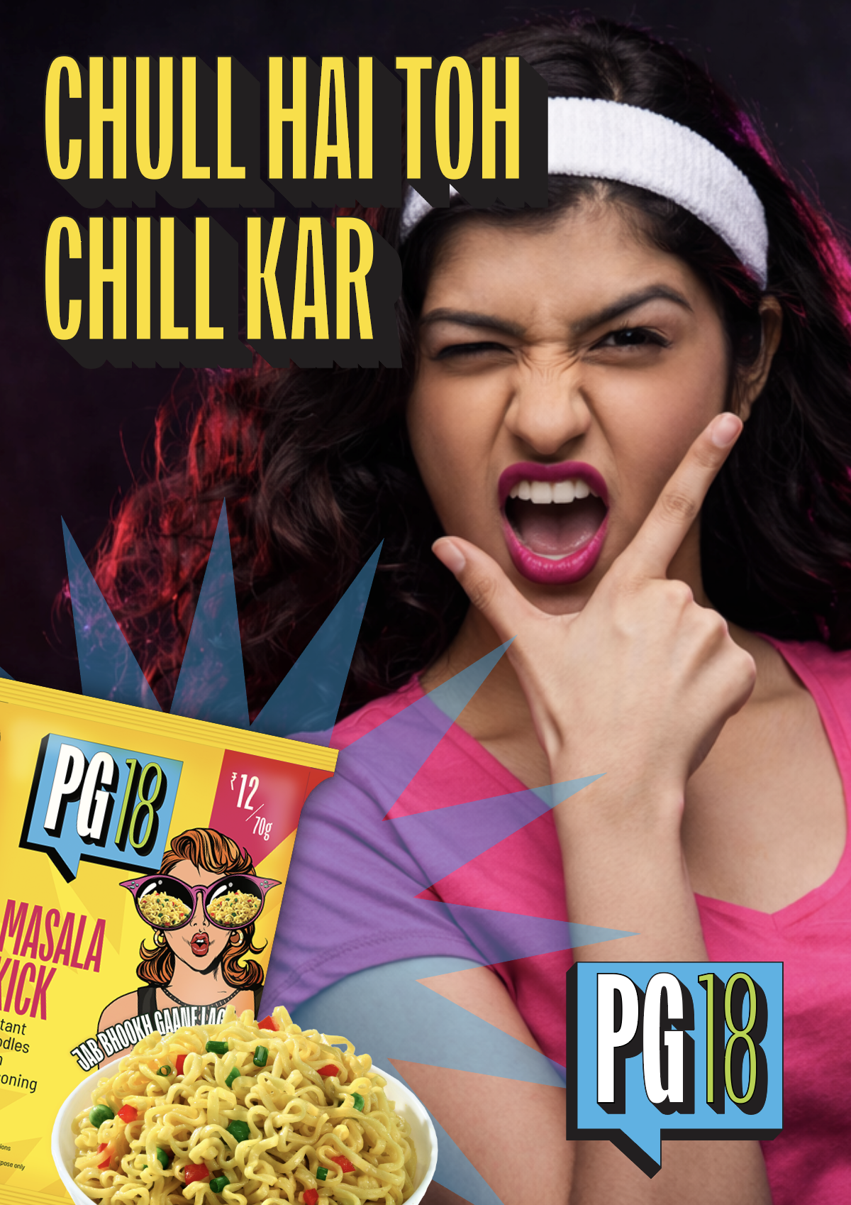
We all grew up with instant noodles as an exciting break from routine, an easy after-school snack that felt special every time. For young adults navigating life on their own, that same convenience and nostalgia still resonate. Together with PG18, we translated this emotion into a bold brand identity, distinctive packaging, and a cohesive visual system built for a new generation.
CLIENT
ApnaKlub
PROJECT
Branding | Visual Identity | Packaging | Web & Print Collaterals
Young adulthood marks a moment of firsts that are all new and exciting. Living independently and figuring life out on your own terms means earning the freedom to make your own choices. With income of their own, even everyday snacks become small but meaningful expressions of independence. Things once restricted are now consciously chosen. PG18 was conceived for this exact moment in life: a brand that brings comfort, character, and confidence to everyday snacking for young adults who are on their own for the first time.
The brand emerged from an intensive discovery and naming exercise for ApnaKlub’s youth-focused, ready-to-cook food venture. Through multiple workshops and creative explorations, a wide spectrum of names were developed and evaluated, eventually leading to PG18. It is a dual reference to hostel life/ PGs and a reference to the coming-of-age culture. The name itself captures the brand’s spirit, reflecting a sense of familiarity, autonomy, and lived experience.
This foundation was followed by an in-depth study of the competitive landscape across Indian and global instant food brands, helping define a clear position within a crowded category. With a primary launch focus on North India, where audiences respond strongly to bold flavour cues and expressive, relatable communication, the brand identity was shaped to feel confident, youthful, and immediately recognisable.
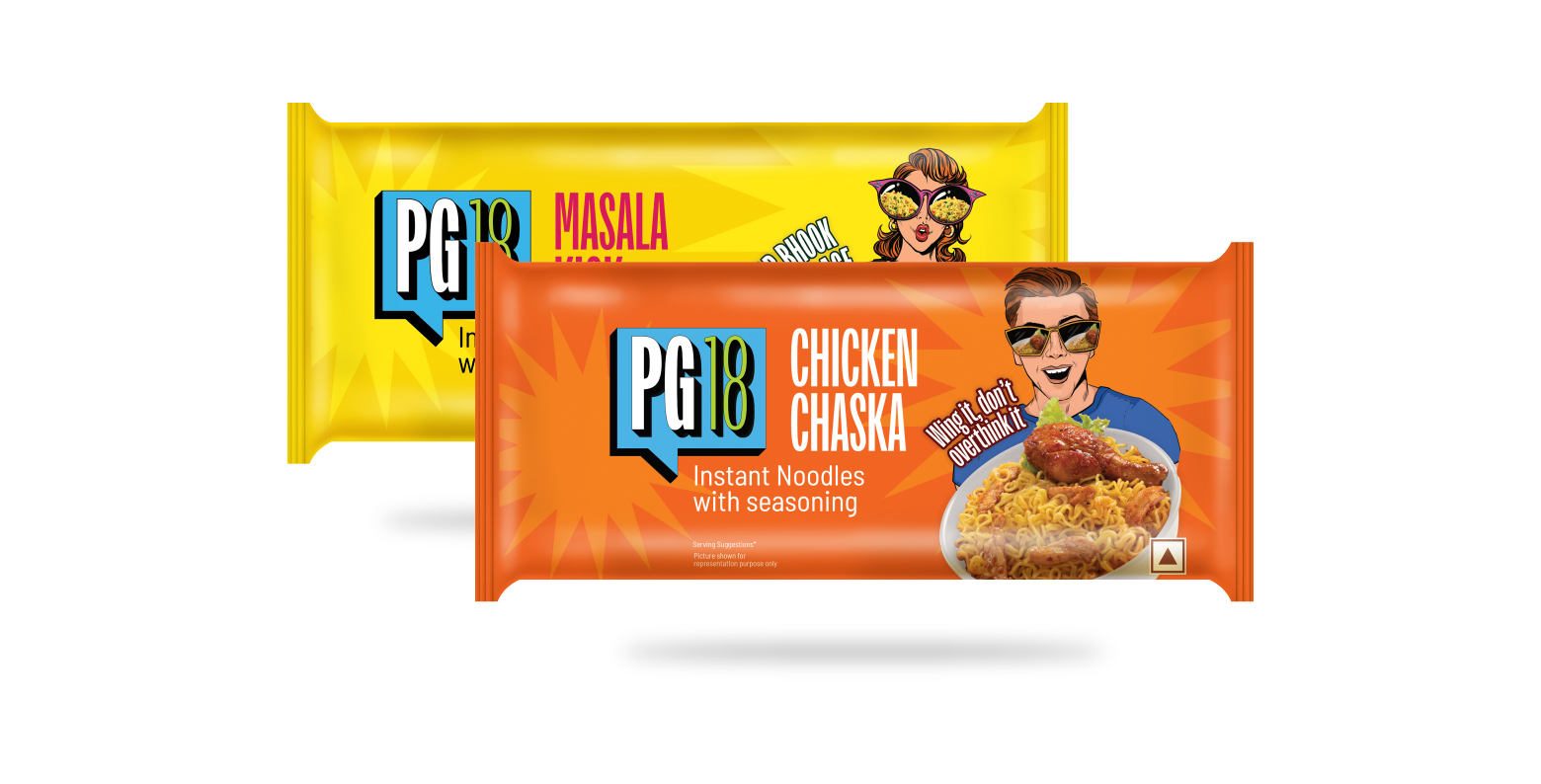
The packaging system brought this identity to life through striking, illustration-led visuals and sharp, conversational copy in Hindi and English that draws from everyday cultural references familiar to Gen-Z. Expressive, character-driven illustrations were paired with clear product cues, while a vibrant colour palette and cohesive visual system ensured strong shelf presence. PG18 ultimately speaks to a generation seeking comfort, convenience, and personality in the everyday.
The PG18 strategy blends personality & practicality, creating food that feels as expressive as it is accessible.
—
—
PG18’s social templates balance utility, personality and play, turning everyday food moments into bold expressions of youth culture.
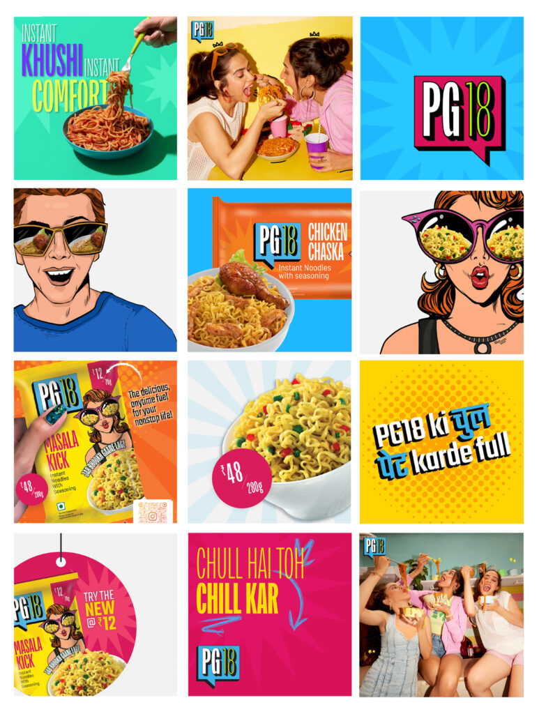
A high-energy mix of colour, bilingual typography and refreshed retro elements gives PG18 a visual presence that feels confident, relevant and instantly recognisable.